
We’re excited to give you an early look at what’s coming: a complete revamp of TimePlanner’s new UI. Our team is hard at work rebuilding the experience to be cleaner, faster, and easier to navigate—so you spend less time wrestling with the interface and more time on the work that matters.
What is changing in TimePlanner’s new UI
Here’s a preview of what’s being redesigned in Teamboard TimePlanner UI.
1. Dashboard
Starting from the dashboard. We not only changed how it normally looks but also revamped the way you add widgets to give a complete view of metrics that matter most to you and your business.
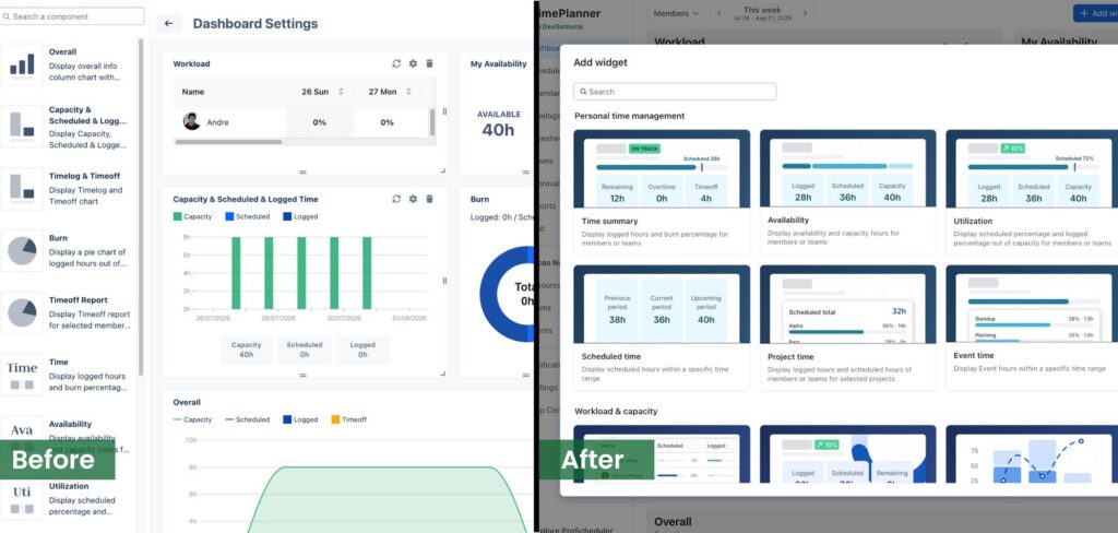
You can find all the widgets you need without having to guess what it will look like in your dashboard.
2. Timelog
Logging working hours does not change much. Yet, we revamped the UI to make each timelog easier to follow and track your work.
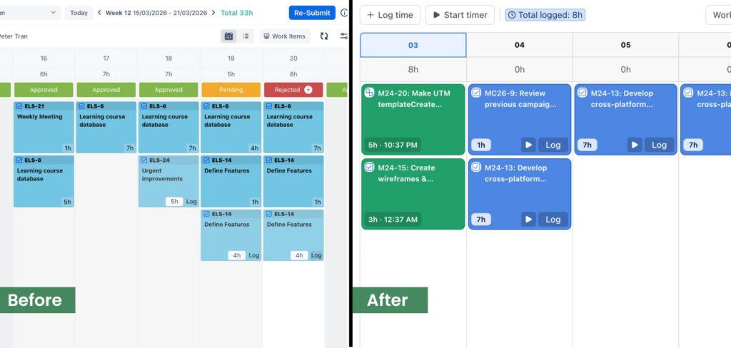
The updated Timelog gives you a clearer, more focused view of your entries, with fewer clicks to record, edit, and review your time. Whether you track as you go or catch up at the end of the day, the new design keeps everything within easy reach.
3. Timesheets
The Timesheets page has been reworked for better visibility. You can now expect a more intuitive layout, making it easy to tell apart how many work hours are in each status: Unsubmitted, Approved, Rejected, and Pending.
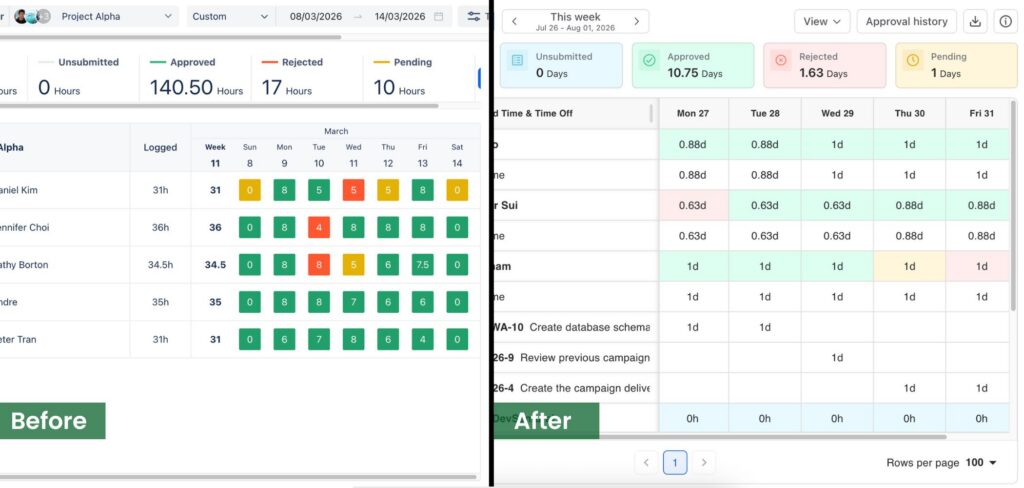
You can also see your full week at a glance with detailed time spent on each task for each member, helping you spot gaps or errors before they become problems. We’ve focused on reducing the friction between filling out your timesheet and getting it approved.
4. Leave
The leave requesting process is now streamlined. You can make a paid time off request more accurately while knowing how many allocation days you have left. We also make half-time off less confusing.
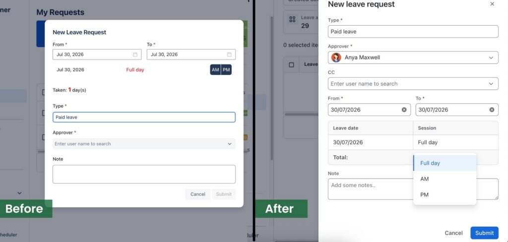
Additionally, managing time off will feel far more natural. The refreshed Leave experience puts your balances, pending requests, and approval status right where you need them.
5. Approval
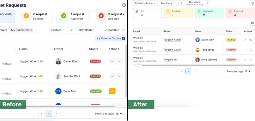
Managers get a streamlined Approval flow built around speed and clarity. Now with leaner queues and quicker reviews, you can keep your team’s timesheets and leave on track, meaning less time spent managing and more time leading.
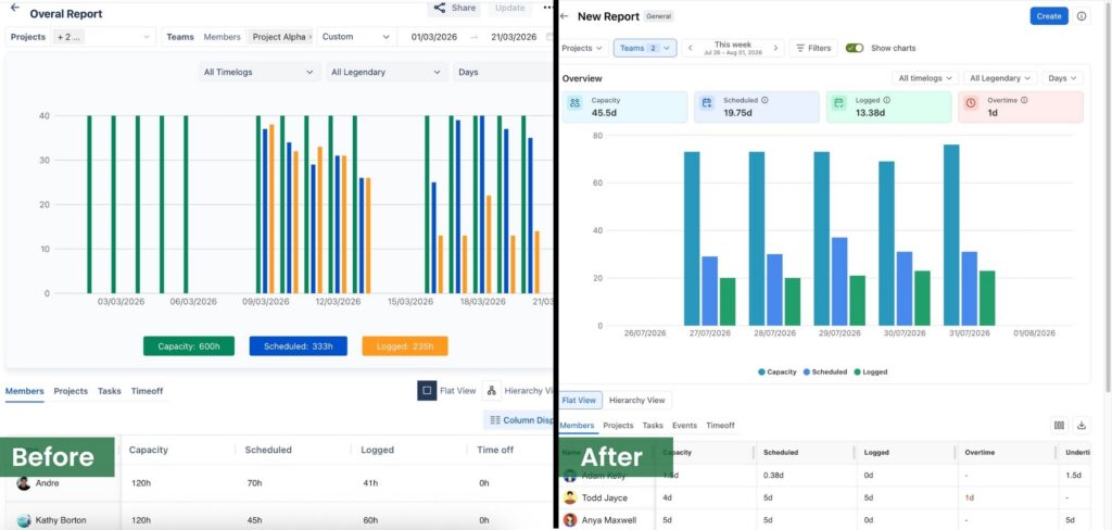
6. Report
Reporting is getting a significant visual upgrade for each report type.
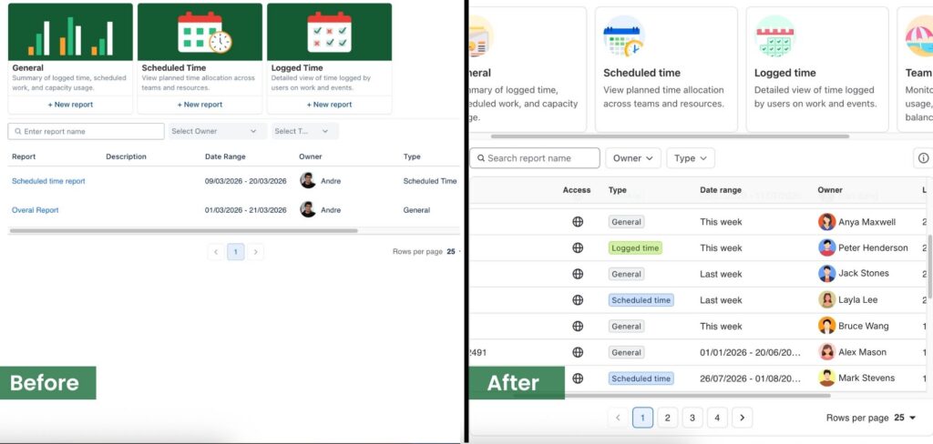
This new experience makes it easier to surface the insights you care about, filter down to exactly what you need, and share results across your team.
7. Cost
The new Cost view brings your time and budget together in one clear picture. Instead of piecing together information and raw data, you’ll be able to understand spend and track it against expectations by using clear visuals.
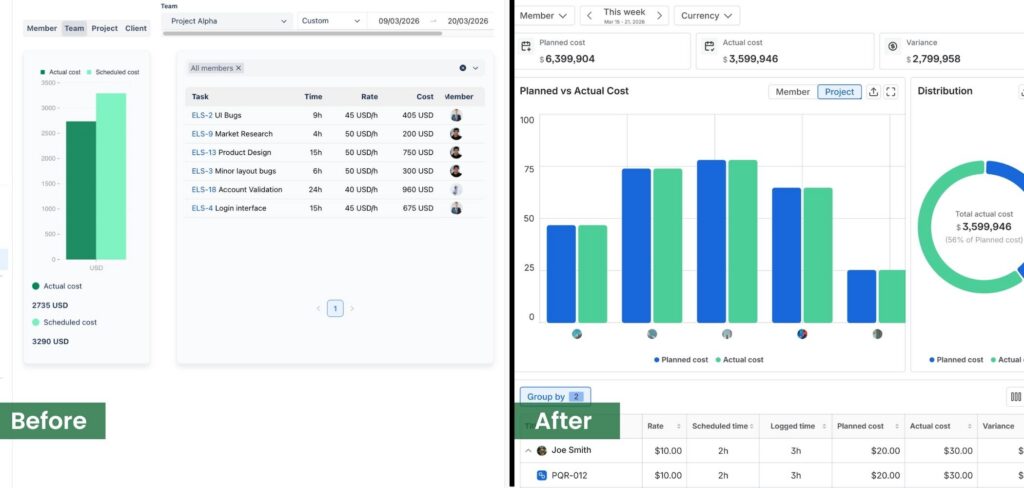
Everything you need at first glance.
What’s next
These are also other updates, such as my profile page, resources page, settings pages, etc. in this TimePlanner’s new UI. We wanted to share the direction early because your work depends on these tools every day—and we’re building this refresh with your feedback in mind. Every design decision comes back to making TimePlanner faster, clearer, and more enjoyable to use.
We’ll be sharing more details, previews, and timelines as we get closer to launch. Keep an eye on this space—we can’t wait to put the new TimePlanner in your hands.
If you have any questions, please contact us via our support desk.